Year: 2008

Sunday Linkdump: August 17, 2008

“In 1976, Cosmonaut Nikolai Peckmann was sent alone to an orbiting space station for what would be called Mission Six- to study the radiation levels and strange circumstances that killed all four crewmen of the last research mission.”

That “Malwebolence” article: The original article; at least 1, 2, 3 seemingly authentic 4chan-member comments on a NYT blog post about the article; NYT’s blog-response-tracking page for the article; 1, 2 Gawker posts about the article; author Mattathias Schwartz’s response to some responses; and a final analysis on The NYT blog “The Medium.”

Beatles musicology.

West Virginia speaks out about Obama: “I don’t like the ‘Hussein’ thing. I’ve had enough of ‘Hussein.'”

Adbusters tries to be insightful about hipsters; people respond.

Continue reading

Leave a Comment

Google favicons

Almost everyone must have noticed by now that Google has a new favicon for its search/news/maps/etc. pages. I personally hate it, I think aside from being drab, it actually doesn’t immediately evoke “Google.” That lower-case ‘g’ is not as recognizable as they seem to be hoping. It’s unfortunate for them that they’ve ended up with few and meager iconic brand signifiers. Their full ‘logo’ (if you can call it that) doesn’t scale well; maybe the most they have going for them is their color scheme, although it is strikingly similar to Windows’/Microsoft’s long-standing color scheme. It’s really got them handcuffed until they can gracefully re-brand with something more versatile. Good to know, then, that it’s only temporary.

I’ve also noticed this Google Reader favicon showing up momentarily as the site loads, though only in Opera. It resembles the large logo on the official Google Reader blog, and I can’t figure out what’s causing it — what is it that Opera is loading before the stylesheet tells it to look elsewhere?

Leave a Comment

WordPress 2.7: Automatic Upgrade in Core!

According to WordPress developer Ryan Boren, the most requested WordPress feature is tentatively slated for the as-yet unscheduled 2.7 release.

This already exists in the form of a third-party plugin, which I’ve actually used successfully before on another blog. I’ve always found upgrading manually to be easy and problem-free, though incredibly tedious. Because I don’t use many plugins or alter any core WordPress files, I think automating the process will be a safe option for me, one that I’ll trust more in the hands of the core development team. Still, I’m sure I’ll wait till it’s been thoroughly tested in a couple versions before using it on this site.

Leave a Comment

That Paris Hilton / Captain Beefheart Photoshop Thing

I know it’s almost two years old now, but on the occasions that I’m reminded of this photo I’m still fascinated by it. Somehow it is the perfect album to have photoshopped into Paris’ hand: the cover is iconic and immediately recognizable, it may be the last thing she’d ever actually listen to, and it’s pink. Still, I wondered; I mean, maybe she was drunk enough that someone just cleverly slipped it to her? She was releasing an album at the time, so it was almost certain that she was just holding that. But it’s like bigfoot, crop circles, UFO videos, you want to believe.

More than that, I think we derived a certain satisfaction from its impossibility. It’s a daily occurrence to watch your cherished bands get snatched up by the popular media, and this photo was a reminder that some of our enthusiasms are very, very safe.

I first spotted it on the WFMU blog (“I can’t imagine Paris getting more than a few bars into Frown Land before ripping it out of her CD player and throwing it out of her window at some homeless person”), but they of course got it from Gawker (“That is truly a cultural juxtaposition”), who got it from goldenfiddle.

Then when I ran across this image of her holding In the Aeroplane Over the Sea, I had to find the original photos that were manipulated. Finally, I did! Here, here, here, and here. There’s even a thread about it on Snopes.

Continue reading

Leave a Comment

Last.fm Seasonal Impact Indices

Everyone’s experienced that thing where you’re listening to something, and you think to yourself, “Holy shit does this remind me of fall 2004.” How strongly certain music is correlated with certain periods of your life depends on many things, including but probably not limited to when you first heard it, when you first liked it, and when your listening to it was most highly concentrated. So, for instance, in my case, most Destroyer albums will recall times and places that are vague at best, and that depend mostly upon first exposure rather than concentration — this as a result of the fact that I listen to every Destroyer album all the time, approximately.

Blueboy’s Unisex, on the other hand, will probably always remind me of the winter of 2006-7, as I listened to it for the first time that season, nine additional times within that season (racking up about 150 tracks listened, according to Last.fm), and virtually never again once spring hit.

Ever since I began submitting listening data to Last.fm in November of 2004, I’ve wondered whether I’d ever enjoy direct access to all those numbers. Then came Last.fm Extra Stats, mercifully collecting all my listening data for me in a tab-separated file that can be pulled into Excel and manipulated to my heart’s content. Here, as a small example of the data, are my top ten artists (by tracks listened) from winter 2006-7, along with total listens for each artist (since November 2004) (now that I’m finally getting around to publishing this post, all the following data is very old):

Winter 2006-7
Artist Winter (S) ↓ Total (T)
Trans Am 163 163
Blueboy 148 163
The Lucksmiths 69 105
Ratatat 50 126
The Moldy Peaches 49 51
White Flight 36 41
Television Personalities 35 35
Beach House 35 64
Revolving Paint Dream 32 58
RJD2 31 52

Now for some methodology. Continue reading
One Response

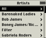
Alphabetization Is Not Fit for Music Libraries

Wikipedia’s article on alphabetization explains:

Advantages of sorted lists include:

  • one can easily find the first n elements (e.g. the 5 smallest countries) and the last n elements (e.g. the 3 largest countries)
  • one can easily find the elements in a given range (e.g. countries with an area between .. and .. square km)
  • one can easily search for an element, and conclude whether it is in the list

The first two advantages are things you almost never need to do with music libraries. And the third has been supplanted by now-ubiquitous search boxes: if you know what you’re looking for, you search; and if you don’t, an alphabetized list is not the way to find it.

Web visionary Ted Nelson (<mst3k>Dr. Ted Nelson?</mst3k>) has been paraphrased as pointing out that “electronic documents have been designed to mimic their paper antecedents,” and that “this is where everything went wrong: electronic documents could and should behave entirely differently from paper ones.” If the folder metaphor is inadequate for digital documents, no wonder it’s so pitiful at handling music. The proximity between pieces of music in a library should least of all be based on the first letter in a band’s name – it’s as arbitrary as sorting them by the vocalist’s month of birth – yet this is how it’s universally done.

Music library organization needs to be re-thought from the ground up. We need to consider how it is that people used to listen to music before it was all on their iTunes. How are your CDs organized (or disorganized) on your shelf? How are they organized in your head? What is it that prompts you to listen to what you listen to when you listen to it? And how can we use computers to adopt and enhance these ways of thinking, rather than forcing us to think like computers? Continue reading

17 Responses

“Substantialiscious”

SubstantialisciousThis word is used in Snickers’ new ad campaign, wherein they plaster these long, awkward neologisms (e.g., “Peanutopolis,” “Hungerectomy,” etc.) on buses and billboards and on their candy bar wrappers themselves.

What struck me about this one is that anybody reading it would promptly assume that it is a fusion of “substantial” and “delicious”; but wouldn’t that produce “substantialicious,” not “-scious”? In fact, the only words that end in “-scious” are “luscious” and the various forms of consciousness. I don’t think they meant to evoke lusciousness, and even if they did, shouldn’t they have coined “Substantialuscious”?

Things got worse when I opened the wrapper:

Substantialiscious \sub-'stan(t)-shu-'li-shus\
(noun). The weight of something when you weigh it with your tongue.

It is, of course, an adjective, a fact that a contributor to Urban Dictionary even tried to point out, albeit incorrectly.

It’s an easy target, I know, but I’m just genuinely surprised that they let something like that get out the door; it’s a fairly clever campaign, and “Hungerectomy” in particular presupposes that the average person is smart enough to know what the suffix “-ectomy” means. And wouldn’t somebody who knows that also know an adjective from a noun? It’s just confusing.

7 Responses

Scary Go Round Style Changes

Once described as being “pretty much perfect,” Scary Go Round is one of my favorite comics. As is the case with most things, I got into it kinda late, and it’ll probably die in the near future, making my weekday mornings cold and bleak. I wish I could remember where I learned about it.

One of the best things about it is its artwork. The colors are stunning, it’s peppered with painstakingly subtle, winking touches, and there’s a weird juxtaposition of ruler-guided lines and rough, endearingly sloppy details like lettering or rows of windows. But it didn’t used to be that way; it began as a spinoff to John Allison’s previous comic, Bobbins, which shifted from hand-drawn to vector art on January 15, 2001, a distinctly digital style that continued through Scary Go Round’s first couple years.

It was shortly after I started reading, in 2006, that the comic went “permanently” (for now) hand-drawn, which to me is far preferable, allowing for much greater nuance in gestures and expressions, and more equipped to carry John’s sense of humor.

Lamenting the fact that I didn’t get to watch its evolution in realtime, I decided to catalogue notable dates in its history, coupled with context from John’s blog and the Scary Go Round forum, because I am curious and anal.

John begins Scareodeleria, intended as a practice ground “to return Scary Go Round to hand-drawn art.” It’s pretty crude.

Continue reading

Leave a Comment