13 posts with tag “software”

Karmic is still just “Linux for human beings.”

Man I wrote this a long time ago. Resigning now to the fact that I won’t finish it.

Even a couple years ago, video editing wasn’t considered an essential part of a desktop, for most users. It was the realm of professionals and hobbyists who could afford the necessary hardware to transcode video in less than an hour.

But after the advent of YouTube, adequate processors, and ubiquitous cameras — in phones, monitors, and now on the iPod nano — everybody feels that it’s their right to add scrolling text and wipes to their little movies. And rightly so; video editing software has long been expensive and difficult for a reason. But it’s almost 2010, and that shouldn’t be the case anymore. It’s no longer too much to expect to be able to put a title and a fade-out on a video where you complain about your hair, even if it is a trivial indulgence. You don’t need to know HTML to run a blog; why should you need to learn scripting languages and FFmpeg switches to run a vlog?

Steve Jobs was famously mistaken in thinking that the next step for personal computing at the turn of the century was video editing, until it took a backseat while Napster made digital music and the iPod the most prominent technologies of this decade. And as all that went on, processors got outrageously fast, and hard drives got outrageously large, even in “low-end” systems. iMovie existed, but has only recently become familiar and comfortable to large numbers of people. Microsoft’s answer to iMovie, “Microsoft Windows Video Editor 1.3” or whatever it must have been called, was feeble, buggy, and went unused as most PC owners had to work hard to derive anything of value from it; iMovie, meanwhile, practically asked Mac owners to use it. It’s my understanding that Microsoft’s video editor has improved lately, but I don’t know for sure.

Anyway, so here we are, with video editing taken for granted by some, and indignantly demanded by others. And, while we’re at it, a relatively large migration toward Ubuntu. 8.10 Intrepid was a landmark release, 9.04 followed suit, and 9.10 is becoming unequivocally the most anticipated Linux distribution by the general populace ever. Even in its beta form it’s being called “almost perfect,” and generally heralded everywhere not only as a triumph of open-source, but as a triumph of operating systems period.

There’s more to life than hard, sterile pragmatism, and if you think otherwise, you are cold and dead and nobody will ever love you.
So!, with all these people working to make Linux accessible, surely they’ve got some decent video editor up their sleeves? Well — as is a typical answer from most Linux users — yes and no. There is Cinelerra, which is very powerful and enjoys a wide user base, but even its manual admits to its Linux heritage, that “Cinelerra is not intended for consumers.” I can attest to this. In addition to Cinelerra I’ve downloaded just about every video editor there is for Linux, from Avidemux to Kdenlive to Kino to PiTiVi. All of them either crash in Ubuntu, are terrifically complicated, or lamentably simple. Simply put, there is no “iMovie for Linux.”

But this is precisely what Mark Shuttleworth is shooting for with Ubuntu. Or, rather, it’s a good metaphor for what he’s shooting for — to make Linux not merely easier to use than other distros, but to be inviting to people who don’t even know what Linux is. This is why Ubuntu’s slogan — “Linux for human beings” — has become so obsolete. Of the things that Linux provided when the Ubuntu project began in 2004, Ubuntu now provides them in a more accessible way than they’ve ever been provided, and if a person has heard of only one Linux distro, it is likely to be Ubuntu.

Now, however, with Shuttleworth explicitly taking aim at Apple, Ubuntu’s slogan — not merely for marketing purposes, but for the underlying vision of the project as a whole — needs to evolve. “Linux for human beings” begins with the premise of Linux, and qualifies it with the promise of ease-of-use. In order to gain the significant market share that Shuttleworth wants to see, and to properly orient Ubuntu’s developers toward that end, the “Linux” part of Ubuntu needs to be secondary. What must instead be emphasized is that it is a powerful, easy, fun, and free operating system that happens to use a Linux kernel.

These things are becoming increasingly true, but, as much as I am impressed by it, I can’t in good conscience say that Karmic fulfills the ultimately desired promise of Ubuntu. Karmic is still just “Linux for human beings.”

At the same time, never before has this promise been more clearly within view. Several huge — huge — things have happened recently, or are happening, to take Ubuntu beyond its current status as merely the best Linux distro, from an eccentric “third-party candidate” to a genuine competitor. Aside from its hugely increased hardware support out-of-the-box (which, bravo), I’m tempted to argue that the improved font rendering in Jaunty is the single most important step in increasing Ubuntu’s appeal — and further that anybody who disagrees with me is hopelessly out of touch with the real world.

Linux users pride themselves on withstanding the most brutal of computing environments, but it’s that kind of egotism that, if unchecked, will prevent Linux from ever gaining on the desktop. If you think pretty wallpapers are a frivolous waste of your disk space, that’s your prerogative — but if you think that it was a bad decision for Canonical to include them in Karmic, given all that they’re trying to accomplish, then you’re not paying attention. There’s more to life than hard, sterile pragmatism, and if you think otherwise, you are cold and dead and nobody will ever love you.

Leave a Comment

Alphabetization Is Not Fit for Music Libraries

Wikipedia’s article on alphabetization explains:

Advantages of sorted lists include:

  • one can easily find the first n elements (e.g. the 5 smallest countries) and the last n elements (e.g. the 3 largest countries)
  • one can easily find the elements in a given range (e.g. countries with an area between .. and .. square km)
  • one can easily search for an element, and conclude whether it is in the list

The first two advantages are things you almost never need to do with music libraries. And the third has been supplanted by now-ubiquitous search boxes: if you know what you’re looking for, you search; and if you don’t, an alphabetized list is not the way to find it.

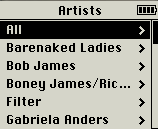
Web visionary Ted Nelson (<mst3k>Dr. Ted Nelson?</mst3k>) has been paraphrased as pointing out that “electronic documents have been designed to mimic their paper antecedents,” and that “this is where everything went wrong: electronic documents could and should behave entirely differently from paper ones.” If the folder metaphor is inadequate for digital documents, no wonder it’s so pitiful at handling music. The proximity between pieces of music in a library should least of all be based on the first letter in a band’s name – it’s as arbitrary as sorting them by the vocalist’s month of birth – yet this is how it’s universally done.

Music library organization needs to be re-thought from the ground up. We need to consider how it is that people used to listen to music before it was all on their iTunes. How are your CDs organized (or disorganized) on your shelf? How are they organized in your head? What is it that prompts you to listen to what you listen to when you listen to it? And how can we use computers to adopt and enhance these ways of thinking, rather than forcing us to think like computers? Continue reading

17 Responses

foobar2000 Is Dead or Dying: Part 1

Originally written June 30, 2007.

There’s always been a significant faction of foobar2000 users whose primary attraction to the player is its appearance, or rather the level of control given to its users over its appearance. In its infancy, with the standard (and still default) UI, very little was possible — the main window consisted solely of a tabbed playlist and several functional toolbars — but people nevertheless took a lot of pride in making it their own, and some impressive things were done with relatively minimal flexibility. It was in the standard UI that users began experimenting with album-level presentation, choosing not to repeat redundantly the artist and album name on each line of the playlist, but to use the second, third, and sometimes fourth lines to display other info, such as year, label, genre, replaygain info, etc. Each of these customizations was unquestionably unique, but most of the broad details of the interface were consistent and inescapable.

The Columns UI component began as an experiment in allowing for multiple columns within the playlist display, emulating the Windows Explorer “Detail” view (and many other Windows programs), with sortability via clickable column headings. Eventually Columns UI added a sidebar and, later, panels, allowing the whole foobar window to be split up indefinitely into panel-based component displays, the playlist viewer becoming just another one of these. This granted much greater flexibility, allowing users to tailor the interface even more precisely to their needs. You could now display album art as prominently as you wanted, or not at all; your entire library tree could be embedded within the main window, rather than tucked away in a pop-up; and with the trackinfo panel’s exceptionally lax (by that era’s standards) stylizations, the personalization of your foobar became even more addictive, and, more importantly, rewarding.

Many seemed hell-bent on concocting the most garish presentations imaginable: giant gothic blue-on-black custom fonts, deep-red 200-px-tall spectrum analyzers, all, of course, coupled with custom OS “vis.”

While some still preferred the purity and elegance of the standard UI, the personalizations made possible by Columns UI were inarguably functional ones, for the most part. Fonts, colors, distribution of panels, and a rudimentary method of text alignment were really as far as you could go. At the core of all the boasted screenshots was a recognizable structure, all slight variations on the theme of playlist+trackinfo+albumlist+albumart. Outside of displaying album art, there was nothing profoundly new that Columns UI allowed you to do — rather, Columns UI gave you more control over how you did what you needed to do.

Continue reading

12 Responses

Windows XP SP3

Microsoft publicly released Windows XP Service Pack 3 yesterday, which means that it should appear in your list of available updates. To grab your own standalone copy of the update, download the EXE or the ISO directly from Microsoft. Lifehacker also has a tutorial on getting SP3 onto a Windows install disc to save yourself loads of trouble later. Read what Ars Technica, Lifehacker, and Wired have to say about the upgrade.

This service pack was rumored in November (by Wired and CNET, among others) to offer a 10% boost in speed, but who knows under what conditions it’ll actually be noticeable. And all this amidst protests against Microsoft’s plan to stop selling XP this summer. Even John Dvorak, whose columns I’ve been reading since adolescence, hates Vista:

You’re not supposed to deliver a new operating system that’s been in development for more than four years yet performs worse than the previous OS. Performance should be at the top, not the bottom, of the to-do list. You get the sense that Microsoft just piles code on top of code and somewhere in the middle of it all is MS-DOS 1.0.

I’ll say.

Leave a Comment

Songbird 0.5

Songbird 0.5 was released last week, and, while not technically inconsistent with claims that its RSS parsing had been “improved,” I was disappointed to see that two of my three podcast subscriptions still aren’t coming through. The problem has been migrated to a new bug ticket.

There’s also a new “Media Views” feature, which looks promising. As of now the only add-on to take advantage of this is a simple tag-cloud library view, but I imagine things could get really elaborate there. Their line, “Tired of music players that look like spreadsheets?”, has me anticipating all kinds of innovative browsing environments; picture a navigable mood-cluster terrain, or a pannable, zoomable, clickable history wavegraph. I’m seriously considering teaching myself enough XUL to be able to write a hotness add-on.

Amazingly, 0.1 was first released over two years ago. And their releases have code-names like Bowie and Eno? Who knew.

4 Responses

Some day, Songbird will:

  • have a proper CoverFlow clone that doesn’t lag or rely on Java (like AlbumApplet), and that allows for custom locations of art on the drive.
  • monitor folders for new music.
  • have an integrated BitTorrent client that puts music from trackers directly into your library.
  • jump to the location in a page where the currently playing mp3 was found.
  • properly recognize all XML podcasts (a known issue).
  • allow you to browse by when albums were added, when they were played (not just last played, but over their entire history), and by hotness.
  • submit to Last.fm.

And on that day…

2 Responses

Firefox 3 Rendering Improvements

Firefox 3 is scheduled to be released later this fall; I haven’t really been following its development, but one thing I have heard about and am excited about is its (or, more accurately, Gecko‘s) new graphics library, Cairo.

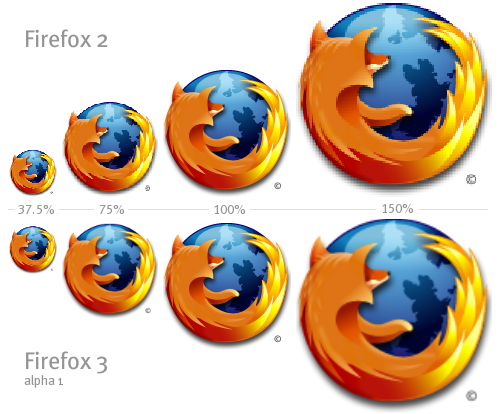
Cairo Image Resizing

First I heard that it would resample rather than simply rescale images, as demonstrated in the image above (via Acts of Volition).

Later I learned that it will also render fonts more smoothly. I enjoy the soft way pages look in Safari for Windows, the result of a different rendering engine, WebKit, so this is something I’m really looking forward to. Here’s an example of Cairo’s font rendering, as seen in Camino 1.2+ for Mac, via hicksdesign:

Cairo Font Rendering

There are very specific reasons for the intentional differences in these approaches to font rendering. It’s a matter of personal preference, and I think my preference will be for Cairo. Some are floored by the superiority of WebKit, and designer Jeffrey Zeldman makes a solid, objective case for it; others are horrified.

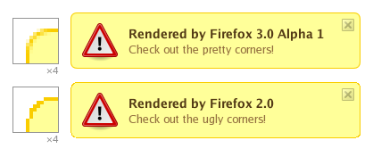
Finally, Gecko’s non-standard CSS attribute -moz-border-radius, a precursor to CSS3‘s border-radius attribute, will make image-less rounded div corners easy and pretty (via Acts of Volition):

Cario Border Radius

I would have posted screenshots of my own, but I don’t trust these alpha builds not to eff things up.

3 Responses

FFmpeg Quality Comparison

Flash video is so great.

Anyway I used to use MediaCoder to convert to flash video, but when it gave me errors, and refused to tell me the specifics of those errors, I took it old school to the command prompt with FFmpeg (which MediaCoder uses anyway). This gives you a lot of useful info about the source file you’re encoding, such as audio sampling rate, frame rate, etc.

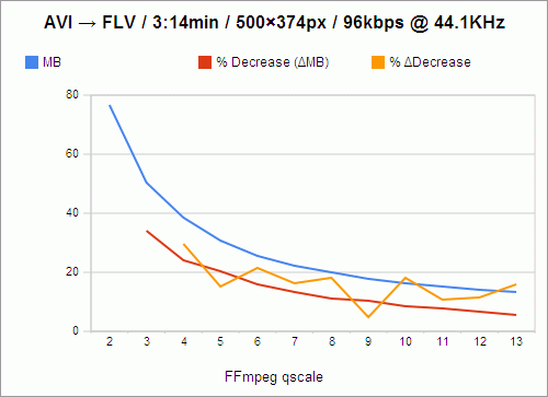
Wanting to find a balance between picture quality and streamability, I began encoding a short length of AVI video at different compression levels. FFmpeg calls this “qscale” (a way of representing variable bitrate qualities, much like LAME‘s -V parameter), and the lower the qscale value, the better the quality. The available qscale values range from 1 (highest quality) to 31 (lowest quality). Going worse than a 13 qscale produces unacceptably poor quality, so that’s as low as I went for the purposes of this test.

I encoded 3:14 minutes of an AVI, resizing it to 500Ã — 374 pixels, and encoding the audio at 96kbps and 44.1KHz, which sounds fine, and is a negligible part of the ultimate file size, so going lower wouldn’t be very beneficial. Plus I find that good audio can create the illusion that the whole thing is of higher quality. Poor audio just makes it sound like “web video.”

Here are the results, courtesy of Google Spreadsheets:

FFmpeg quality vs. filesize chart

The filesize, of course, goes down as quality goes down. And the loss in filesize also decreases, not just in amount, but in percentage as well, as indicated by the red line. For instance, the value of the red line at qscale 3 is 33.97%, which means that in going from qscale 2 to qscale 3, 33.97% of the filesize is shaved off.

However, because these losses are not perfectly exponential, I knew that there had to be qscale values that were more “efficient,” in a sense, than others — values that, despite being high, and causing a lower change in filesize than the previous step in qscale, still caused a comparably large change in filesize. For instance, still looking at the red line, you’ll notice that going from 2 to 3, as I said, shaves off 33.97% of the filesize, while going from 3 to 4 only shaves off 23.93% of the filesize; and that is a 29.56% decrease in change-in-filesize, which is a relatively large cost. We want the change-in-filesize to remain as high as possible for as long as possible.

Now, if you follow the red line from 4 to 5, you’ll see that that’s a 20.32% loss in filesize, which is pretty close to our previous 23.93% loss in filesize in going from 3 to 4. In fact, we’ve only lost 15.09% of change-in-filesize from the previous step. So these are the values we really want to examine: change in change-in-filesize, represented by the orange line.

This is nowhere close to exponential, nor does it follow any predictable decline. It darts around, seemingly at random. And we want to catch it at its lowest values, at points that represent changes in qscale that were nearly as efficient as the previous change in qscale. So the most desirable qscale values become, quite obviously, 5, 9, and 11.

What this means is that if quality is your primary concern (and you’re not crazy enough to encode at qscale 1), go with 5. qscale 5 turns 3:14 minutes of video into 30.62MB, which requires a download rate of 157.84KB/s to stream smoothly. qscale 11 will give you about half the filesize, and require a download rate of 77.37KB/s. But, because that’s the level at which picture quality really begins to suffer, and because most people don’t really mind buffering for a few seconds initially, I’m probably going to stick with qscale 9, whose videos take up 91.58 kilobytes per second, and which is by far the most efficient qscale anyway, with only a 4.92% change in change-in-filesize.

One caveat: This whole examination presupposes (as far as I can tell) that if it were possible to measure and chart the changes in the actual perceived visual quality of videos encoded at these qscale values, the curve would be perfectly geometric or exponential, with no aberrations similar to those above, and with all extrapolated delta curves showing no aberrations either. Given that, it might be easier to believe that every step you take through the qscale is of equal relative cost, and that there are no “objectively preferable” qscale values. But that is a lot more boring.

25 Responses