9 posts with tag “statistics”

Alphabetization: Part II

First, some good news: Songbird is now in public beta! It’s amazing how stable things have gotten just over the last six months. And, significantly, it now features a Playback History API, which by the looks of things allows developers access to the entire play history of any song in a library, something that is crucial to the kind of deep library scavenging I’ve been pining for.

Since I last wrote, everything I see or read seems to inspire my half-baked ideas about the better ways we can browse our unmanageably large music libraries. After telling a friend about these ideas, he said:

Yeah, it’s actually really frustrating. I intentionally keep the number of artists on my iPod small so I don’t have to sort to find things I’m currently into.

Me too.

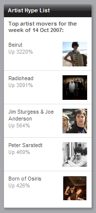
Then there are the people who are doing a lot of (real) work towards novel interfaces like the (hypothetical) ones I’m describing; Last.fm’s “Islands of Music” (explained here) demonstrates the kind of artist-similarity topology that would make browsing your library a more pleasant experience; Lee Byron explains in more detail how he developed that Last Graph infovis; necimal releases a Music Recommendations extension for Songbird that promises to use Last.fm’s data to find within your library artists similar to the one playing; and the Aurora project, part of the Mozilla Labs concept browser series, depicts a radical three-dimensional view of files and data with auto-clustering, which, if applied to a music library, would be nothing short of incredible.

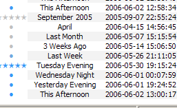
I’ve also thrown together a pitiful little mock-up of what Songbird might look like when you start it up with the kind(s) of extensions I’m hoping for:

The two core components depicted are the Start Page and the Timeline View. The Start Page I feel would be seriously valuable, one of the ideas behind all these blatherings of course being that one doesn’t always have a destination in mind when opening their music library. The Start Page would offer a number of convenient “jumping-off” points, pulling you into your library to explore it further — by artist similarity, maybe, or by play history proximity, after just a couple clicks.

The Timeline View is a zoomable timeline, shown here zoomed to a daily view. Zooming out could show you albums played within recent weeks; then months, quarters, etc. These albums might be sorted by Periodical Impact, something I explained in depth here; essentially they would be sorted not by the raw number of times they were played within any given period, but by how distinct they were to that period.

Even these meager ideas are leagues ahead of what’s available, and I’m not even a data analyst. Just imagine how a library’s play history data could be exploited by somebody trained in these things.

One Response

Last.fm Seasonal Impact Indices

Everyone’s experienced that thing where you’re listening to something, and you think to yourself, “Holy shit does this remind me of fall 2004.” How strongly certain music is correlated with certain periods of your life depends on many things, including but probably not limited to when you first heard it, when you first liked it, and when your listening to it was most highly concentrated. So, for instance, in my case, most Destroyer albums will recall times and places that are vague at best, and that depend mostly upon first exposure rather than concentration — this as a result of the fact that I listen to every Destroyer album all the time, approximately.

Blueboy’s Unisex, on the other hand, will probably always remind me of the winter of 2006-7, as I listened to it for the first time that season, nine additional times within that season (racking up about 150 tracks listened, according to Last.fm), and virtually never again once spring hit.

Ever since I began submitting listening data to Last.fm in November of 2004, I’ve wondered whether I’d ever enjoy direct access to all those numbers. Then came Last.fm Extra Stats, mercifully collecting all my listening data for me in a tab-separated file that can be pulled into Excel and manipulated to my heart’s content. Here, as a small example of the data, are my top ten artists (by tracks listened) from winter 2006-7, along with total listens for each artist (since November 2004) (now that I’m finally getting around to publishing this post, all the following data is very old):

Winter 2006-7
Artist Winter (S) ↓ Total (T)
Trans Am 163 163
Blueboy 148 163
The Lucksmiths 69 105
Ratatat 50 126
The Moldy Peaches 49 51
White Flight 36 41
Television Personalities 35 35
Beach House 35 64
Revolving Paint Dream 32 58
RJD2 31 52

Now for some methodology. Continue reading

One Response

Alphabetization Is Not Fit for Music Libraries

Wikipedia’s article on alphabetization explains:

Advantages of sorted lists include:

  • one can easily find the first n elements (e.g. the 5 smallest countries) and the last n elements (e.g. the 3 largest countries)
  • one can easily find the elements in a given range (e.g. countries with an area between .. and .. square km)
  • one can easily search for an element, and conclude whether it is in the list

The first two advantages are things you almost never need to do with music libraries. And the third has been supplanted by now-ubiquitous search boxes: if you know what you’re looking for, you search; and if you don’t, an alphabetized list is not the way to find it.

Web visionary Ted Nelson (<mst3k>Dr. Ted Nelson?</mst3k>) has been paraphrased as pointing out that “electronic documents have been designed to mimic their paper antecedents,” and that “this is where everything went wrong: electronic documents could and should behave entirely differently from paper ones.” If the folder metaphor is inadequate for digital documents, no wonder it’s so pitiful at handling music. The proximity between pieces of music in a library should least of all be based on the first letter in a band’s name – it’s as arbitrary as sorting them by the vocalist’s month of birth – yet this is how it’s universally done.

Music library organization needs to be re-thought from the ground up. We need to consider how it is that people used to listen to music before it was all on their iTunes. How are your CDs organized (or disorganized) on your shelf? How are they organized in your head? What is it that prompts you to listen to what you listen to when you listen to it? And how can we use computers to adopt and enhance these ways of thinking, rather than forcing us to think like computers? Continue reading

17 Responses

FFmpeg Quality Comparison

Flash video is so great.

Anyway I used to use MediaCoder to convert to flash video, but when it gave me errors, and refused to tell me the specifics of those errors, I took it old school to the command prompt with FFmpeg (which MediaCoder uses anyway). This gives you a lot of useful info about the source file you’re encoding, such as audio sampling rate, frame rate, etc.

Wanting to find a balance between picture quality and streamability, I began encoding a short length of AVI video at different compression levels. FFmpeg calls this “qscale” (a way of representing variable bitrate qualities, much like LAME‘s -V parameter), and the lower the qscale value, the better the quality. The available qscale values range from 1 (highest quality) to 31 (lowest quality). Going worse than a 13 qscale produces unacceptably poor quality, so that’s as low as I went for the purposes of this test.

I encoded 3:14 minutes of an AVI, resizing it to 500Ã — 374 pixels, and encoding the audio at 96kbps and 44.1KHz, which sounds fine, and is a negligible part of the ultimate file size, so going lower wouldn’t be very beneficial. Plus I find that good audio can create the illusion that the whole thing is of higher quality. Poor audio just makes it sound like “web video.”

Here are the results, courtesy of Google Spreadsheets:

FFmpeg quality vs. filesize chart

The filesize, of course, goes down as quality goes down. And the loss in filesize also decreases, not just in amount, but in percentage as well, as indicated by the red line. For instance, the value of the red line at qscale 3 is 33.97%, which means that in going from qscale 2 to qscale 3, 33.97% of the filesize is shaved off.

However, because these losses are not perfectly exponential, I knew that there had to be qscale values that were more “efficient,” in a sense, than others — values that, despite being high, and causing a lower change in filesize than the previous step in qscale, still caused a comparably large change in filesize. For instance, still looking at the red line, you’ll notice that going from 2 to 3, as I said, shaves off 33.97% of the filesize, while going from 3 to 4 only shaves off 23.93% of the filesize; and that is a 29.56% decrease in change-in-filesize, which is a relatively large cost. We want the change-in-filesize to remain as high as possible for as long as possible.

Now, if you follow the red line from 4 to 5, you’ll see that that’s a 20.32% loss in filesize, which is pretty close to our previous 23.93% loss in filesize in going from 3 to 4. In fact, we’ve only lost 15.09% of change-in-filesize from the previous step. So these are the values we really want to examine: change in change-in-filesize, represented by the orange line.

This is nowhere close to exponential, nor does it follow any predictable decline. It darts around, seemingly at random. And we want to catch it at its lowest values, at points that represent changes in qscale that were nearly as efficient as the previous change in qscale. So the most desirable qscale values become, quite obviously, 5, 9, and 11.

What this means is that if quality is your primary concern (and you’re not crazy enough to encode at qscale 1), go with 5. qscale 5 turns 3:14 minutes of video into 30.62MB, which requires a download rate of 157.84KB/s to stream smoothly. qscale 11 will give you about half the filesize, and require a download rate of 77.37KB/s. But, because that’s the level at which picture quality really begins to suffer, and because most people don’t really mind buffering for a few seconds initially, I’m probably going to stick with qscale 9, whose videos take up 91.58 kilobytes per second, and which is by far the most efficient qscale anyway, with only a 4.92% change in change-in-filesize.

One caveat: This whole examination presupposes (as far as I can tell) that if it were possible to measure and chart the changes in the actual perceived visual quality of videos encoded at these qscale values, the curve would be perfectly geometric or exponential, with no aberrations similar to those above, and with all extrapolated delta curves showing no aberrations either. Given that, it might be easier to believe that every step you take through the qscale is of equal relative cost, and that there are no “objectively preferable” qscale values. But that is a lot more boring.

25 Responses

Hotness 1.6.c.1

Totally warranted subversioning!

My foray into MP3Toys was ultimately short-lived, brought to a halt when I found what people were doing with Single Column Playlist for foobar, particularly the playlist-embedded album art. Back in the foobar saddle, I also gave in and tried out the “official” Play Count component, which I had avoided for so long because it didn’t support %FIRST_PLAYED%, and because I wasn’t sure I wanted my playback statistics only kept in the database — even though writing them to the files posed a lot of trouble as well. Turns out, playback statistics stored by the official component are less sensitive to changes to the files it’s keeping track of than the unofficial one, which means I only have to be a little careful to keep all my stats intact, while being able to play and track files that I’m still seeding.

This, along with the invaluable $cwb_datediff() function provided by Bowron’s new foo_cwb_hooks component, called for a rewrite to the hotness code, which had been stagnating in some marginally compatible 1.5 version since May. After severely trimming the code down and robusting things up, I thought of a new and totally non-arbitrary way to soften the blow hotness scores receive when songs are played. I hated seeing them leap to 100 every time, and this new softening method makes so much sense, utilizing existing baseline calibrations to keep things a lot more interesting. How anybody tolerated the old method is beyond me.

Anyway, here it is.

I also dug up a lot of old screenshots this week and I’m planning a nostalgia-fueled retrospective in the near future.

Leave a Comment