Year: 2009

What I Want: A Comprehensive Photo Browser

litl_lifestyle_04After watching a demo video of the litl webbook; watching with envy the face recognition features of iPhoto and Picasa; and using Polar Rose, Photo Finder from Face.com, and Cooliris — I realized just how much potential there is for a fully-integrated photo browsing application. Either web- or desktop-based, photos could be pulled from your Flickr/Facebook/MySpace/etc. feeds, as well as those of your friends/family/contacts; existing tags would also be imported, and face recognition applied; and they would all be presented to you in a pure browsing interface, where the sources of these photos are hidden, and you are free to scan through them as part of one big collection.

I tried Flock again — for the tenth time in five years, it seems — thinking that it probably includes something like this. But bafflingly, it doesn’t. The “Media Bar” has a nice scrolling film strip of photos and videos, but only presents a single feed at a time. Not to mention, of course, that it doesn’t recognize any tags or faces

The social activity aggregators that I have seen are too all-encompassing, pulling in blog posts and statuses on top of photos, most often presenting those photos only as tiny thumbnails until they’re clicked. The guy in that litl video is right when he says that “We’re at the time where there’s the smallest percentage of photos seen to photos taken, because everyone takes photos but they just kind of end up on their computer, never to be seen again.” I guess truthfully I just kind of want to run litl OS in a VirtualBox.

Anybody know of a way to do something like this?
One Response

Nitpicking the Default Theme in Ubuntu Karmic Koala

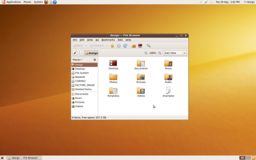
ubuntu-karmic-default

As shown here and here, among other places:

  • The titlebar height is not quite tall enough to comfortably contain the titlebar text.
  • The titlebar text shadow is too prominent, and conflicts with the glossy 3D appearance of the titlebar.
  • The titlebar button borders and symbols are too high-contrast, and the symbols are off-center by one pixel.
  • The window corners are not anti-aliased.
  • The notification area icons are too low-contrast.
  • The new wallpaper is a little lifeless.

Some positives are that the new Humanity icon theme is a great improvement, and that the font rendering continues to impress.

3 Responses

Opera Border Radius in 2010?

Opera has been maybe the most standards-conscious browser over its lifetime. This has resulted in frustration among users, who believe it to be “broken” because it doesn’t render lazy code correctly — code that takes advantage of the forgiveness of other browsers, allowing you to write sloppily and get away with it.

But it has also resulted in frustration among web developers, who are impatient at Opera’s reluctance to adopt any standards that haven’t been laser-etched into platinum tablets down in the W3C’s basement foundry. Among them is the border-radius property, an effect that will probably be out of vogue anyway by the time Opera’s Presto engine implements it. Of course, since CSS3 has been kicked around the W3C offices since 1999, and border-radius itself since 2001, most other engines (Gecko, WebKit, KHTML) stopped waiting and began inventing their own properties for this effect. Presto has not.

In the course of reminding myself of this lamentable fact by searching for workarounds today, I noticed that some Opera developers are casually dropping hints that the full-blown, unqualified, W3C-crafted border-radius itself has made an appearance in Presto 2.3, and that the next version of Opera will be powered by 2.4.

It’s all true, I saw it on Twitter.

3 Responses

Google’s Left Margin or: Hey, Twitter’s Good for Something

I noticed a short while ago that the left margin on Google’s search results pages seemed to have increased, and the logo’s size decreased. I asked a friend if he’d noticed, and he said that he hadn’t.

I searched Google for ‘google left margin,’ turning up no results. Of course, if it only happened this morning, nothing written about it would likely have been indexed by Google yet — unless they blogged about adding a dozen pixels to their margin, which seemed unlikely. But I had a hunch that if other people were noticing it, they must be talking about it, somewhere.

That somewhere, of course, is Twitter, where my suspicion was confirmed. The tagline for search.twitter.com (See what’s happening — right now.) is right — there’s really no better place to go to find out what people are saying about something that happened between five minutes and a couple hours ago.

7 Responses

Building a Songbird Add-On: Part 0

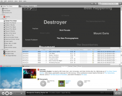
songbird-artist-web-media-view-mockupAfter complaining about alphabetization in music libraries for — wow — almost a year, I’ve decided it’s time to do something about it.

I know very little about JavaScript and XUL, but that is going to have to change. My goal is to complete the add-on described here, an Artist Web media view, or perhaps “Constellations.”

To make the task appear less daunting, I’ve broken it up into many milestones of marginal improvements. If I follow this timeline, the plugin will be usable and released to the public as Constellations v0.1 on July 27.

Milestone ver Description Target Date Actual Date
i 0.0.1 display all artists in a vertical list 08 Jun 2009
ii 0.0.2 display most recent Last Played value for each artist 15 Jun 2009
iii 0.0.3 display total Play Count for each artist 22 Jun 2009
iv 0.0.4 vary font sizes according to total artist Play Count 29 Jun 2009
v 0.0.5 vary font colors according to total artist Play Count 6 Jul 2009
vi 0.0.6 vary font colors according to Last Played 13 Jul 2009
vii 0.0.7 arrange artist names left-to-right instead of vertically 20 Jul 2009
viii 0.1 focus first of the artist’s tracks in the playlist pane when the artist’s name is clicked 27 Jul 2009
ix 0.1.1 resize/re-color based on play frequency instead of play count 10 Aug 2009
x 0.2 options window that alternates between which variable is assigned to which font property 31 Aug 2009

I’m going to create a separate blog to track my progress on this, for several reasons:

  1. Threat of shame. If I emphasize publicly that I am going to do this, and I fail, I’ll be kind of embarrassed. Hopefully that will motivate me to actually complete the project.
  2. Geeks love proving that they’re smarter than you. If I’m having a tough time with some relatively elementary code, maybe people will mock me in the form of writing the correct code themselves. I’m certain that what I’m attempting could be done in no time flat if I’d been formally educated in things like JavaScript. Maybe the biting sarcasm of people who need to demonstrate their intelligence will show me where I’m going wrong.
  3. To encourage plagiarism. Look, I’ll admit that I’d be proud if the add-on that comes out of this bore my name. But ultimately, I don’t care. If somebody sees what I’m doing, likes it, wants it to be their own, and knows they can beat me to it, then great. At least we’ll have the add-on.

If you feel like mocking me or encouraging me you can email me at topdownjimmy@gmail.com, leave/follow comments on this post, or visit my dedicated Constellations blog to see where I’m taking this and how quickly I fail.

2 Responses