Year: 2009

What Zalgo Is

Frequently described as “Lovecraftian” or “Cthulhu-inspired,” Zalgo actually bears a closer similarity to Shub-Niggurath or Yog-Sothoth, the latter described by Lovecraft as resembling

protoplasmic flesh that flowed blackly outward to join together and form that eldritch, hideous horror from outer space, that spawn of the blankness of primal time, that tentacled amorphous monster which was the lurker at the threshold, whose mask was as a congeries of iridescent globes, the noxious Yog-Sothoth, who froths as primal slime in nuclear chaos beyond the nethermost outposts of space and time!

It is a manifestation of a terror that is based on insanity and chaos rather than ordinary mortal danger — comics, of course, being an apt target for this idea, as their innocence and relative shallowness make for an especially jarring juxtaposition.

Weirdly, Stephin Merritt of The Magnetic Fields wrote a song about Yog-Sotheth with a side-project he called “The Gothic Archies,” a bizarre coincidence given that the first known Zalgo creations involve Archie comics.

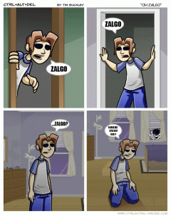
First conceived by Something Awful member “Shmorky” in 2004 as grim modifications of old comic strips, it was embraced by other members of the forum. After remaining in obscurity for several years, Zalgo appears to have resurfaced in a pair of Something Awful threads (1, 2) mocking the webcomic Ctrl+Alt+Del, where the practice of Photoshopping certain strips eventually evolved into “Zalgo edits,” beginning I believe with this post (Google cache) by member Dammerung in October 2008.

ohzalgo

A convenient summary of all these Photoshops was compiled in this post (Google cache).

The blog Grim Reviews posted an overview of the phenomenon shortly after its fall 2008 resurrection. The meme subsequently flourished on 4chan. A b3ta.com forum member named Evilscary credits himself with some of the more popular and more recent Garfield Zalgo comics, writing in his profile:

I seem to be responsible for the recent surge of ZALGO that has engulfed the internet.
I didn’t create ZALGO (indeed, he created himself in a torrent of darkness and corruption) but I certainly aided in reviving his following.

And because Internet loves Garfield parodies, it wasn’t long before Zalgo became popular and therefore no longer funny. One Something Awful member even noticed a reference to it (Google cache) in the game Space Trader.

Maybe most responsible for the curiosity around Zalgo is the proliferation of weird Unicode diacritics that accompany more recent Zalgo-babble, which creates the illusion that whatever Zalgo is, it is now directly affecting your computer and that by Googling it you have introduced it into your home. Try it and you’ll see what I mean. I’m pretty certain 4chan is responsible for this clever twist on the idea.

With the increased popularity of Zalgo, someone has come forward claiming to have thought it up in 1998 as “simply encroaching darkness” before infecting various forums with the idea in 2003, though most people aren’t taking this claim seriously.

As a side-note it also reminds me of the 1997 film Event Horizon, whose “antagonist” is some extra-dimensional realm of pure chaos.

More Zalgo resources include:

21 Responses

Liberation: The New Arial sans-serif Substitute in Jaunty

One of the first things I noticed after booting into Ubuntu 9.04, Jaunty Jackalope, is that Google Reader and Gmail looked a bit off. I quickly realized they were both using different sans-serif fonts than they had previously (Nimbus Sans), despite Firefox’s preferences having Nimbus set as the default sans.

I knew that Google isn’t so great with their stylesheets, in some cases declaring a font-family of just “Arial,” with no “sans-serif” backup in the font-stack (which would, of course, let Firefox substitute in whichever default sans the user had set – in my case, Nimbus).

I also knew through playing around with ~/fonts.conf that Linux allows you to define substitutions for different font names. It was my hunch that there was something new about Jaunty (which has been praised for its better presentation of text) that defined Liberation Sans – the font I determined I was looking at – as the preferable substitute for Arial.

After looking around a bit I found the culprit in /etc/fonts/conf.avail/30-metric-aliases.conf. Around line 182 you should see the beginning of a section devoted to the Microsoft typefaces, and shortly under that (around line 186), the line:

<family>Liberation Sans</family>

Just above that, insert the following line:

<family>Nimbus Sans L</family>

Reboot your system, and when you’re back up, Ubuntu should now replace any calls for Arial with Nimbus Sans.

Of course, this should only be done if you prefer Nimbus Sans. It’s been claimed that Liberation Sans is better hinted than either Nimbus or FreeSans, and from the looks of things, it is. Still, I just prefer Nimbus. That serif on the upper-case ‘J’ in Libertine especially bothers me.

I still love Linux Libertine as a Times substitute, however.

One Response

Upgrading Ubuntu through a Mirror

I’d begun my upgrade to Jaunty last night around 7pm, and woke up this morning to find that the package downloads had hardly made any progress. This because the main Ubuntu servers are being hammered due to Jaunty’s release yesterday morning.

I followed one tutorial that should have set me up to download (and upload, I assume) all the packages through a peer-to-peer protocol, but that didn’t seem to help at all. It did make me more comfortable editing my /etc/apt/sources.list file, however, so I thought I’d try sticking some mirrors in there, rather than using the generic us.archive.ubuntu.com servers.

I found this list of mirrors, and noticed that there was one at MIT, only several blocks away from my apartment. I went into sources.list

sudo gedit /etc/apt/sources.list

…and did a search/replace on all instances of us.archive.ubuntu.com/ubuntu/ with ubuntu.media.mit.edu/ubuntu/. Re-ran the upgrade through update-manager, and I was downloading at blazing speeds that completed in just about five minutes.

If you’re having a rough time getting your upgrade to complete, find a nearby server from this list and stick it into your sources.list file.

Looking forward to using 9.04!

Leave a Comment

Fancey in “The Office”

Yesterday I learned that (Todd) Fancey of Fancey (and of The New Pornographers) did a song for an episode of “The Office.” Here’s a quick video:

I can’t tell if that’s him on the album cover but man I hope it is. From Fancey’s MySpace blog:

If you have a chance to check out the hilarious and Emmy nominated “Dinner Party” episode of NBC’s “The Office” (Aired a couple days ago April 10, 2008), you will hear a song called “That One Night”. The lyrics are by the brilliant writers Gene Stupinsky and Lee Eisenberg. I did the music and made the recording. I was thrilled to be asked because I truly love that show, it’s the BEST. Special thanks to Alicen Schneider and Dave Madden of NBC.

Leave a Comment

Ubuntu, Font Hinting, & You: A Cautionary Tale

This post was written regarding Ubuntu 8.10, Intrepid Ibex.

This isn’t the first time I’ve encountered hinting; I’ve seen it before in GIMP, even when I was using it in Windows, this font rendering option that was inexplicably on by default, and resulted in horrible kerning and misshapen letterforms. I don’t claim to know a lot about the technicalities of hinting, but everything I do understand about it agrees that it is meant to improve the shapes of letters. If this is the case, somebody is doing something very, very wrong. I haven’t seen a hinted font that looked anything other than sickly and disheveled.

I’ve complained before about the typography in Ubuntu, but my contention then was with the fonts that were in use by default, not with the way they were rendered. What I didn’t realize at the time is that the rendering is the bulk of the problem.

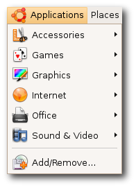
applicationsmenuI found this image on the Ubuntu site, and I am still in disbelief that they choose to represent themselves with font rendering like this. Look at that capital ‘A’ and ‘V’; look at the way that lower-case ‘l’ towers over its neighbors, nothing more than a single-pixel-width vertical line; look at the kerning in the ‘Rem’ of ‘Remove’ – it’s no wonder Ubuntu has about a 2% worldwide market share. They expect people to want to look at that every day of their lives? I know these are relatively subtle details, but their effects are subliminal and, I believe, psychologically hazardous.

~/.fonts.conf

Of course, when it comes to Linux, for every problem there are a few dozen solutions – or one very, very complicated solution. GNOME, the default desktop for Ubuntu, arrives with a “Font Rendering Details” dialog box in its appearance settings, to placate the mouth-breathing philistines who need a GUI to get things done. And it doesn’t really help much. I knew I’d have to get my hands dirty in ~/.fonts.conf, this XML file that is capable (and only capable) of incredibly fine-tuned font tweaking.

[Fonts are] the #1 reason why Linux hasn’t seen any significant adoption on the desktop/laptop yet. Robert Scoble

The trouble, as is the case with most Google results you get when looking for help with Linux, is that there is a glut of quick fixes, blocks of code directed towards one specific person and their specific system, that they are then told to paste into a file or save into a directory, with little to no explanation about why this solution is going to work. Or there’s the technical documentation that isn’t geared towards users. There’s no middle ground (unless you count the occasional, skeletal wiki that hasn’t been updated since 2004).

Only after looking at countless ~/.fonts.conf examples was I able to glean what was going on inside them. The full power of this file allows you to target with amazing precision any variant or size of any font your system might display and give it its own unique properties; but there are really only three(ish) of these properties that you need to know about, and I am going to explain them here.

antialias

Anti-aliasing is the trick that makes your pixels not look like pixels. You’ve noticed this when you’ve seen poorly resized images with jagged edges – they’re not properly anti-aliased. Similarly, if fonts are not anti-aliased, they look like black Tetris pieces on a white background. Anti-aliasing is going on all the time without you knowing about it, and you’d really have to make an effort not to have it, but it’s worth putting in your ~/.fonts.conf file for good measure. You’ll want to apply it to all fonts on your system, so the syntax would be:

<match target="font">
 <edit name="antialias" mode="assign">
  <bool>true</bool>
 </edit>
</match>

You can probably figure out what these things mean, but I will link to a complete manual for ~/.fonts.conf syntax at the end of this post.

rgba

This one is a matter of personal preference, I guess. I don’t see how anybody of sound mind could stand to have pink, beige, and turquoise pixels sprinkled around the edges of their letters – the result of “sub-pixel rendering” – but I guess the argument is that it allows them to be sharper. Whatever.

Trust me when I say that things look best if you tell ~/.fonts.conf to disable sub-pixel rendering, which is done like so:

<match target="font">
 <edit name="rgba" mode="assign">
  <const>none</const>
 </edit>
</match>

If you happen to be schizophrenic, or colorblind or whatever, then yes, fine, you can turn on sub-pixel rendering by changing none to rgb, to reflect the composition of your monitor’s subpixels (which are almost certainly in the order Red-Green-Blue, from left to right). Have fun scratching your eyeballs out.

rgba=rgb

rgba=rgb

rgba=none

rgba=none

Admittedly it would be nice if there were some antialiasstyle property you could set to antialiasslight or something, to lighten up those gray pixels a little bit.

hinting / autohint / hintstyle

Put it on my tombstone: Turn Off Hinting. I’m begging you. If somebody tries to tell you that this is a matter of preference, they are lying to you, and are not your friend, and are probably banging your girlfriend. If you leave hinting on, Georgia will not look like Georgia, Lucida will not look like Lucida, and Nimbus will not look like Helvetica.

hintstyle=hintnone

hintstyle=hintnone

hinting=true, autohint=true

hinting=true, autohint=true

Here is how you Turn Off Hinting®:

<match target="font">
 <edit name="hinting" mode="assign">
  <bool>false</bool>
 </edit>
 <edit name="autohint" mode="assign">
  <bool>false</bool>
 </edit>
 <edit name="hintstyle" mode="assign">
  <const>hintnone</const>
 </edit>
</match>

Alternatively, if you positively demand more “crispness” from your fonts, even at the expense of aesthetics, you might want to give slight hinting a try. From the above code, change hinting and autohint to true, and hintstyle to hintslight:

hintstyle=hintslight

hintstyle=hintslight

That’s it, roughly speaking. It’s my understanding that some specific fonts do look better if specifically targeted and adjusted with maybe slight hinting. But that’s for another day. If you do as I’ve instructed, things will be so much better for you. Leave a comment if you want my PayPal address.

This post would not have been possible without the help of these sites:

  • ArchWiki: I know nothing about Arch Linux, but this wiki page has a lot of good info.
  • fontconfig.org: the most complete and recent ~/.fonts.conf reference I’ve found.
  • Ubuntu Wiki: contains an example of a very comprehensive (if dated) ~/.fonts.conf file. Study it and learn how to do other stuff.
  • The Masterplan: another sample ~/.fonts.conf file, and the only other one that I know of that turns off hinting and subpixel rendering.

34 Responses

Google using inline CSS?

With only one font-family? And it’s Arial? The nerve!

<td class=bubble rowspan=2 style="font-family:arial;text-align:left;font-weight:bold;padding:5 0"><b>Celebrating 5 years of Gmail</b></td>

I don’t have Arial installed, so this shows up as my default serif, because they don’t even bother to include the generic ‘sans-serif’ font-family.

Leave a Comment

How to Change the Clock Theme in GNOME Do

gnome-do-clockAs far as I can tell, there are no additional “themes” out there. But I did find the SVG files the clock uses in

/usr/share/gnome-do/ClockTheme

It would be easy enough to replace these; ideally I guess there would be a section in the GNOME Do wiki to upload clock theme packages. The hands of the clock are another matter, generated by Do itself. As it is, I’ve never created an SVG in my life, so I’m stuck with a numberless clock for now.

2 Responses