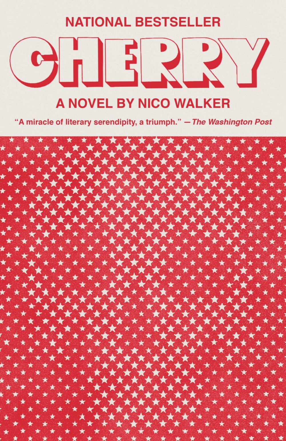
How are you going to take one of the best book covers of the last couple years and turn it into the most banal film poster?
9 posts with tag “design”

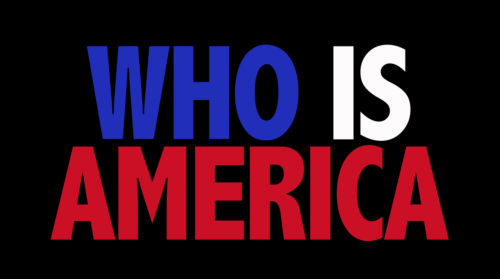
The typography of Sacha Baron Cohen’s “Who Is America?”
I couldn’t help but notice how jarring the titles for Showtime’s “Who Is America?” are, but I couldn’t put my finger on why. It’s clearly some condensed extra bold, which are often pretty ungainly, with some exceptions (Futura Bold Codensed, of Nike fame). My first thought was that it might be something like Calibri or Tahoma, some unsightly humanist sans that was even possibly manually stretched.
I Googled around for a screenshot of the titles, and what I found instead was a lot of promotional material that primarily does use Futura Bold Condensed:
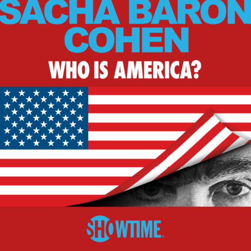

(And Arial Bold, unfortunately.)
I can’t help but wonder if the designers behind the titles in the aired show were trying to mimic Futura Bold Condensed, but either weren’t able to or didn’t know they weren’t using the same typeface.
I admit I had to look it up, but the typeface they are using is Abadi Condensed Extra Bold. Why this typeface? After a little more Googling I learned that Abadi is included in several Microsoft products.
What isn’t included in most Microsoft products? Futura Bold Condensed.
“It looks like dirty old plastic.”
Ubuntu Orange is #DD4814
According to this.
But what’s Ubuntu Aubergine?
The New Ubuntu Lucid Look pt. 2: Reactions and Follow-Ups
Ever since my impatient and juvenile deconstruction of the new “light” GTK themes for Ubuntu Lucid, there’s been a lot of talk elsewhere, as well as some more clues about the new interface.
First came Mark Shuttleworth’s announcement on the rebranding. Something that seems to have been overlooked, most likely because of its ambiguous wording, is his mention of a new desktop font:
We have commissioned a new font to be developed both for the logo’s of Ubuntu and Canonical, and for use in the interface. The font will be called Ubuntu, and will be a modern humanist font that is optimised for screen legibility.
It sounds here like he’s only talking about one font: the logo font we’ve already seen some of. But “for use in the interface”? Unless he’s talking about having two variants within the same family known as “Ubuntu,” it doesn’t seem that this logo font will translate well to menus and buttons. Here’s hoping they’re developing something a little more pleasant than DejaVu Sans, whose bulkiness has long been a cause for ire among Ubuntu users. And although I’ve always found it to be rather nice (provided that it’s bumped down a size), I don’t doubt that the artwork team could come up with something that exceeds it.
 Maybe the most positive thing to come out of Shuttleworth’s announcement is his explanation behind the logic of the two colors, orange and aubergine. These two colors, as well as some other visual cues, are the vocabulary used to distinguish between the different applications and users of Ubuntu. It’s clear that a lot of thought went into this design vocabulary, and, as many have said, the new website mockup and other miscellany, such as the CD case and concepts for signage, are pretty much home runs for Canonical’s art team. It doesn’t approach perfection, by any means, but it’s far more than any of us probably imagined to be possible. For that they deserve enormous acclaim.
Buttons
Sadly, far too much of the conversation around this redesign has been focused on the new default button placement. It’s an interesting choice, one that I’m sure they wouldn’t make lightly, and it would be valuable to have a discussion about the merits of different button placements — a discussion that consisted of something other than “WAHHHHH MAC ZOMG BUTTON FAIL.”  GNOMEr Ivanka Majic mercifully explained some of the reasoning behind this decision in a recent blog post, and there are valid arguments to be made for all kinds of different approaches — in fact, in my opinion they’ve got it wrong. But it warmed my heart a little bit to read Mark Shuttleworth’s response to this bug report (as pointed out by Web Upd8):
The issue is not a bug, it’s a difference of opinion on what is the best result. We may change it, or we may hold it.
Fuck yes! You tell ’em, Mark. For as much complaining as I’ve done about the aesthetics of this new desktop theme, “usability” is much more a science (though still inexact), and if you believe that these new button locations are more rational, and that people will ultimately benefit from them, then by all means, yes, do it. It’s that kind of (relatively) bold experimentalism that makes me think they’ve got some balls after all.
 And please, guys, please don’t ask for this to be made into another option. This same thing happened when everybody started bitching about Karmic’s new Notify-OSD behavior. Obviously option-bloat presents several technical problems, but it’s philosophically unsound, as well; it’s the easy way out. Here’s what Mark had to say on the matter:
In Ayatana, we’ll take an opinionated stance, and we’ll apply some common principles to the design process, and we’ll live with the results.
I have no interest whatsoever in making it possible for anybody to have any environment they want – we already have that. I’m interested in driving forwards to build a default out of the box experience which is as good as we can make it for the new, consumer user.
Meanwhile, even a blog as important as Web Upd8 is plagued by this attitude:
But I’m putting my money on the fact that nothing will be done regarding this. Why? If Ubuntu copy the OS X theme, they must really like Apple, right? The secret announcement of the new theme that came in the last day of the UI freeze and all that was also something very Apple-ish. Well then, just like Apple, they won’t listen to what the users want and will do things their way. The only difference is Ubuntu was supposed to be open. But I really hope I’m wrong!
First, this represents a grave misunderstanding of the word “open.” Second, “listening to what the users want” is impossible. Which users? On which issues? Whose wants are determined in what way? This is not productive discussion. Nor is this:
There is no particular reason for moving them to the left, it’s change for the sake of change
I can forgive someone for not having read any of the rationale behind the new button placement, but to assume so hastily that it was an arbitrary decision is unfair and closed-minded.
There’s of course plenty more to be said, but I’ll wrap up here with two quotes, the first from Mark Shuttleworth:
Experiments are also not something we should do lightly. The Ubuntu desktop is something I take very personally; I feel personally responsible for the productivity and happiness of every Ubuntu user, so when we bring new ideas and code to the desktop I believe we should do everything we can to make sure of success first time round. We should not inflict bad ideas on our users just because we’re curious or arrogant or stubborn or proud.
And, finally, Máirín:
Some folks understandably believe art and design are stuffs enshrouded in a mysterious haze of incense smoke without much logic or reason involved. I get it. I’ve been there too, and I think it’s easy to feel that way — discussions about art works sometimes get a bad reputation for being anywhere from fussy, to bizarre, to completely pointless.
You may find solace in the fact that there’s actually plenty of logical principles and elements and a vocabulary for them that can be use to discuss such works in a productive manner that doesn’t involve ‘invoking an embodiment of emotive symbolism’ or similar. I strongly recommend you explore some of this vocabulary, as not only will it help you more effectively communicate your critique but reading through a brief survey of basic design principles will probably even help you explain why you feel a particular way about an element of a work you’re critiquing.
Ubuntu’s New Branding

Read This Guy’s Blog
I have a couple rants-in-waiting about Ubuntu. This guy says everything I could say way better than me. Go read his blog.
Nitpicking the Default Theme in Ubuntu Karmic Koala

As shown here and here, among other places:
- The titlebar height is not quite tall enough to comfortably contain the titlebar text.
- The titlebar text shadow is too prominent, and conflicts with the glossy 3D appearance of the titlebar.
- The titlebar button borders and symbols are too high-contrast, and the symbols are off-center by one pixel.
- The window corners are not anti-aliased.
- The notification area icons are too low-contrast.
- The new wallpaper is a little lifeless.
Some positives are that the new Humanity icon theme is a great improvement, and that the font rendering continues to impress.