Featuring a new icon (among other things).
112 posts with category “Tech”
Weird Text Shadows on Google Reader in Firefox 3.1/3.5 Betas
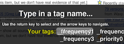
Does anybody else get these? When you navigate to your labels or subscriptions using keyboard shortcuts, the highlighted item in this modal window thing has a text “shadow” or duplicate sitting ten pixels over to the left. It’s been bothering me for a while now and I can’t find anybody else talking about it. I guess I’m supposed to file a bug?
Liberation: The New Arial sans-serif Substitute in Jaunty
One of the first things I noticed after booting into Ubuntu 9.04, Jaunty Jackalope, is that Google Reader and Gmail looked a bit off. I quickly realized they were both using different sans-serif fonts than they had previously (Nimbus Sans), despite Firefox’s preferences having Nimbus set as the default sans.
I knew that Google isn’t so great with their stylesheets, in some cases declaring a font-family of just “Arial,” with no “sans-serif” backup in the font-stack (which would, of course, let Firefox substitute in whichever default sans the user had set – in my case, Nimbus).
I also knew through playing around with ~/fonts.conf that Linux allows you to define substitutions for different font names. It was my hunch that there was something new about Jaunty (which has been praised for its better presentation of text) that defined Liberation Sans – the font I determined I was looking at – as the preferable substitute for Arial.
After looking around a bit I found the culprit in /etc/fonts/conf.avail/30-metric-aliases.conf. Around line 182 you should see the beginning of a section devoted to the Microsoft typefaces, and shortly under that (around line 186), the line:
<family>Liberation Sans</family>Just above that, insert the following line:
<family>Nimbus Sans L</family>Reboot your system, and when you’re back up, Ubuntu should now replace any calls for Arial with Nimbus Sans.
Of course, this should only be done if you prefer Nimbus Sans. It’s been claimed that Liberation Sans is better hinted than either Nimbus or FreeSans, and from the looks of things, it is. Still, I just prefer Nimbus. That serif on the upper-case ‘J’ in Libertine especially bothers me.
I still love Linux Libertine as a Times substitute, however.
Upgrading Ubuntu through a Mirror
I’d begun my upgrade to Jaunty last night around 7pm, and woke up this morning to find that the package downloads had hardly made any progress. This because the main Ubuntu servers are being hammered due to Jaunty’s release yesterday morning.
I followed one tutorial that should have set me up to download (and upload, I assume) all the packages through a peer-to-peer protocol, but that didn’t seem to help at all. It did make me more comfortable editing my /etc/apt/sources.list file, however, so I thought I’d try sticking some mirrors in there, rather than using the generic us.archive.ubuntu.com servers.
I found this list of mirrors, and noticed that there was one at MIT, only several blocks away from my apartment. I went into sources.list…
sudo gedit /etc/apt/sources.list
…and did a search/replace on all instances of us.archive.ubuntu.com/ubuntu/ with ubuntu.media.mit.edu/ubuntu/. Re-ran the upgrade through update-manager, and I was downloading at blazing speeds that completed in just about five minutes.
If you’re having a rough time getting your upgrade to complete, find a nearby server from this list and stick it into your sources.list file.
Looking forward to using 9.04!
Ubuntu, Font Hinting, & You: A Cautionary Tale
This isn’t the first time I’ve encountered hinting; I’ve seen it before in GIMP, even when I was using it in Windows, this font rendering option that was inexplicably on by default, and resulted in horrible kerning and misshapen letterforms. I don’t claim to know a lot about the technicalities of hinting, but everything I do understand about it agrees that it is meant to improve the shapes of letters. If this is the case, somebody is doing something very, very wrong. I haven’t seen a hinted font that looked anything other than sickly and disheveled.
I’ve complained before about the typography in Ubuntu, but my contention then was with the fonts that were in use by default, not with the way they were rendered. What I didn’t realize at the time is that the rendering is the bulk of the problem.
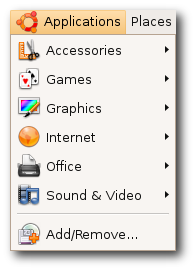 I found this image on the Ubuntu site, and I am still in disbelief that they choose to represent themselves with font rendering like this. Look at that capital ‘A’ and ‘V’; look at the way that lower-case ‘l’ towers over its neighbors, nothing more than a single-pixel-width vertical line; look at the kerning in the ‘Rem’ of ‘Remove’ – it’s no wonder Ubuntu has about a 2% worldwide market share. They expect people to want to look at that every day of their lives? I know these are relatively subtle details, but their effects are subliminal and, I believe, psychologically hazardous.
~/.fonts.conf
Of course, when it comes to Linux, for every problem there are a few dozen solutions – or one very, very complicated solution. GNOME, the default desktop for Ubuntu, arrives with a “Font Rendering Details” dialog box in its appearance settings, to placate the mouth-breathing philistines who need a GUI to get things done. And it doesn’t really help much. I knew I’d have to get my hands dirty in ~/.fonts.conf, this XML file that is capable (and only capable) of incredibly fine-tuned font tweaking.
[Fonts are] the #1 reason why Linux hasn’t seen any significant adoption on the desktop/laptop yet. Robert Scoble
The trouble, as is the case with most Google results you get when looking for help with Linux, is that there is a glut of quick fixes, blocks of code directed towards one specific person and their specific system, that they are then told to paste into a file or save into a directory, with little to no explanation about why this solution is going to work. Or there’s the technical documentation that isn’t geared towards users. There’s no middle ground (unless you count the occasional, skeletal wiki that hasn’t been updated since 2004).
Only after looking at countless ~/.fonts.conf examples was I able to glean what was going on inside them. The full power of this file allows you to target with amazing precision any variant or size of any font your system might display and give it its own unique properties; but there are really only three(ish) of these properties that you need to know about, and I am going to explain them here.
antialias
Anti-aliasing is the trick that makes your pixels not look like pixels. You’ve noticed this when you’ve seen poorly resized images with jagged edges – they’re not properly anti-aliased. Similarly, if fonts are not anti-aliased, they look like black Tetris pieces on a white background. Anti-aliasing is going on all the time without you knowing about it, and you’d really have to make an effort not to have it, but it’s worth putting in your ~/.fonts.conf file for good measure. You’ll want to apply it to all fonts on your system, so the syntax would be:
<match target="font">
 <edit name="antialias" mode="assign">
  <bool>true</bool>
 </edit>
</match>
You can probably figure out what these things mean, but I will link to a complete manual for ~/.fonts.conf syntax at the end of this post.
rgba
This one is a matter of personal preference, I guess. I don’t see how anybody of sound mind could stand to have pink, beige, and turquoise pixels sprinkled around the edges of their letters – the result of “sub-pixel rendering” – but I guess the argument is that it allows them to be sharper. Whatever.
Trust me when I say that things look best if you tell ~/.fonts.conf to disable sub-pixel rendering, which is done like so:
<match target="font">
 <edit name="rgba" mode="assign">
  <const>none</const>
 </edit>
</match>
If you happen to be schizophrenic, or colorblind or whatever, then yes, fine, you can turn on sub-pixel rendering by changing none to rgb, to reflect the composition of your monitor’s subpixels (which are almost certainly in the order Red-Green-Blue, from left to right). Have fun scratching your eyeballs out.
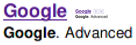
rgba=rgb
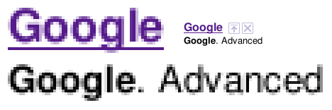
rgba=none
Admittedly it would be nice if there were some antialiasstyle property you could set to antialiasslight or something, to lighten up those gray pixels a little bit.
hinting / autohint / hintstyle
Put it on my tombstone: Turn Off Hinting. I’m begging you. If somebody tries to tell you that this is a matter of preference, they are lying to you, and are not your friend, and are probably banging your girlfriend. If you leave hinting on, Georgia will not look like Georgia, Lucida will not look like Lucida, and Nimbus will not look like Helvetica.

hintstyle=hintnone
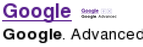
hinting=true, autohint=true
Here is how you Turn Off Hinting®:
<match target="font">
 <edit name="hinting" mode="assign">
  <bool>false</bool>
 </edit>
 <edit name="autohint" mode="assign">
  <bool>false</bool>
 </edit>
 <edit name="hintstyle" mode="assign">
  <const>hintnone</const>
 </edit>
</match>
Alternatively, if you positively demand more “crispness” from your fonts, even at the expense of aesthetics, you might want to give slight hinting a try. From the above code, change hinting and autohint to true, and hintstyle to hintslight:
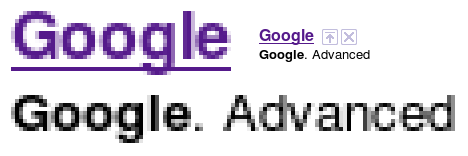
hintstyle=hintslight
That’s it, roughly speaking. It’s my understanding that some specific fonts do look better if specifically targeted and adjusted with maybe slight hinting. But that’s for another day. If you do as I’ve instructed, things will be so much better for you. Leave a comment if you want my PayPal address.
This post would not have been possible without the help of these sites:
- ArchWiki: I know nothing about Arch Linux, but this wiki page has a lot of good info.
- fontconfig.org: the most complete and recent ~/.fonts.conf reference I’ve found.
- Ubuntu Wiki: contains an example of a very comprehensive (if dated) ~/.fonts.conf file. Study it and learn how to do other stuff.
- The Masterplan: another sample ~/.fonts.conf file, and the only other one that I know of that turns off hinting and subpixel rendering.
Google using inline CSS?
With only one font-family? And it’s Arial? The nerve!
<td class=bubble rowspan=2 style="font-family:arial;text-align:left;font-weight:bold;padding:5 0"><b>Celebrating 5 years of Gmail</b></td>I don’t have Arial installed, so this shows up as my default serif, because they don’t even bother to include the generic ‘sans-serif’ font-family.
How to Change the Clock Theme in GNOME Do
 As far as I can tell, there are no additional “themes” out there. But I did find the SVG files the clock uses in
/usr/share/gnome-do/ClockTheme
It would be easy enough to replace these; ideally I guess there would be a section in the GNOME Do wiki to upload clock theme packages. The hands of the clock are another matter, generated by Do itself. As it is, I’ve never created an SVG in my life, so I’m stuck with a numberless clock for now.
Macbook Wheel Predictive Sentence Technology
The aardvark admitted its fault.
The aardvark admitted it was wrong.
The aardvark asked for an aardvark.
The aardvark asked for a dagger.
The aardvark asked for health.
The aardvark asked for a ride.
The absinthe arrived by airmail.
The abortion went well.
The actor asked for an aardvark.
The actor asked for abstinence.
The actor asked for redemption.
The advertisement was effective.
The agile aardvark arrived by airmail.
The agile aardvark bathed with beauties.
The agriculture was cultivated by the coral.
The aggravated driver beeped on his horn.
The aggravated rooster scratched the dirt.
The Althusserian scholar gave his copy of Lacan’s “Ecrits” to the
abortion doctor.
The amiable Althusserian scholar asked the aardvark for absinthe.
The amiable crocodile brushed his teeth with a toothbrush.
The amiable doctor performed the operation admirably.
The annex was covered with asbestos.
The annex was crawling with beetles.
The apple was airmailed by the doctor.
The apple was consumed by the amiable crocodile.
The apple was inquiring about the amiable crocodile’s friend.
The aquamarine lifevest was not used.
The aquamarine lifevest was unpopular.
The armchair was uncomfortable.
The armchair was favored by the amiable housecat.
The ass asked for a better absinthe.
The ass brayed at the moon.
The assumptive doctor did not accept our personal check.
The assumptive agricultural expert eyed our absinthe suspiciously.
The attractive peanut farmer graded the term paper.
The attractive rooster preened its feathers to attract absinthe.
The auxiliary generator has malfunctioned!
The awning covered the agile aardvark during the amiable rainstorm.
The awning was too tall to touch.
The babbling baby asked the aardvark for some absinthe.
The babbling baby baked brownies with the amiable crocodile.
The babbling baby basked in its mother’s affection.
The babbling baby bounced the ball at the babbling brook.