Year: 2010

Ubuntu’s Semantic Indicator Color Palette

It wasn’t until Mark Shuttleworth’s announcement of “windicators” that I learned of the rationale behind the palette of notification colors in the indicator applet. To quote:

[Windicators] would follow the same styling as Ayatana indicators: Semantically colored: with red for critical problems, orange for alerts, green for positive status changes and blue for informative states that are not the default or usual state.

This came as a real surprise given that I had (and still have) never seen a blue or orange indicator icon.

The obvious and primary objection is that four colors in a palette to convey meaning is far too many. Shuttleworth even said as late as April 1 — just four weeks before Lucid’s release — “Personally, my expectation is that green vs orange/red is as far as we want to go.” Two colors is an absolute maximum here — one for negative messages about something being broken, the other merely to notify you of something — although even one should suffice: “Something has changed; requesting your attention.”

If “orange is for alerts” and “green is for positive status changes,” then why do new IM messages turn the messaging icon green? Isn’t that an alert? What is “positive” about getting a new message? What if it’s your boss firing you? Your boyfriend breaking up with you? A spambot?
Continue reading

4 Responses

Gowalla’s Misleading “Follow Friends” Page

Recently I got a Nexus One, which had me curious to discover the value (if any) of location-sharing applications like Foursquare and Gowalla. I had dormant accounts for both, and decided to see who among my contacts were actually using these things. I imagined not many.

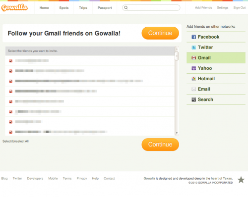
Foursquare’s friend finder was straightforward and I was able to add three or four people. Gowalla’s, on the other hand, misled me into sending an invite to all 947 people in my Google contacts. This includes people I bought stuff from on Craigslist; old bosses; old girlfriends; co-workers; probably even prospective employers.

The trick was in mimicking a fairly standard “Step 2” format for these types of functions. It appears that I’m being presented two choices here: the first, to begin following only those contacts who are already on Gowalla; the second, to send invite emails to all checked names in the list.

Instead, both buttons do exactly the same thing. So when I clicked the button at the top, an email was sent to every person on that list. There was no pop-up window telling me, “You are about to send an email to 947 people. Continue?”

Fortunately I hadn’t used my full name on my profile; the email people received came from no-reply@gowalla.com or something similar; and I deleted my profile as soon as I realized what had happened. So hopefully I wasn’t as incriminated as I may have otherwise been. I know I roll my eyes whenever a friend has fallen for an obvious trap like that. And I like to think I’m pretty good at spotting these tricks. But this layout is outright deceptive.

Leave a Comment

The New Ubuntu Maverick System Font

When Mark Shuttleworth announced the rebranding of Ubuntu, it seemed nobody noticed that he mentioned a new system font was being developed. Currently Bitstream Vera Sans is the default (if I’m not mistaken), appearing on menu bars, title bars, buttons — pretty much everywhere. I’ve always thought it has served its purpose well, and was frankly a little worried that they wouldn’t get the new system font right. Type design is extraordinarily tricky.

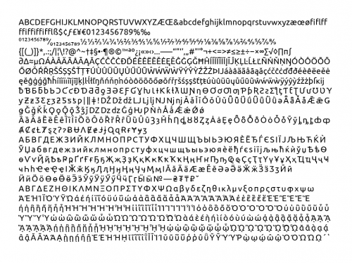
Now however details are starting to emerge. OMG! Ubuntu! describes how to get a bootleg copy of it. And at UDS back in May, Bruno Maag gave a session entitled “Making Beautiful Fonts” in which he elaborated on the creation of the new font. There is now video of that session, as well as the slides, which were sadly not included in the frame.

My first impression is that it feels a bit too stiff, rigid, and tech-y. Of course there’s no way to tell until you use it on your desktop. Reassuring, however, that they’re giving it proper italics.

One Response

Flash vulnerability; upgrade to 10.1 RC in Ubuntu

Adobe has announced a potential security risk in versions of Flash earlier than 10.0.45.2. This includes the versions in Lucid’s default repositories.

If you’re feeling paranoid or would just like to try the latest Flash 10.1 release candidate, you can download it from Adobe, and follow the install instructions from Web Upd8.

Update: The final 10.1 release from Adobe has hit the main Ubuntu repositories. A software update should do it.

Leave a Comment

Web Typography in Ubuntu: Part 1

One of the first things a careful observer will likely notice about a fresh Ubuntu install is the distinctly odd appearance of their favorite websites. The cause for this is that, although Ubuntu ships with a fair selection of fonts, they aren’t properly assigned as aliases to the proprietary fonts that most websites call for; Helvetica and Arial have a perfect cousin in FreeSans, yet are substituted with Liberation Sans by default, the latter of whose stemmed “1” and barred “J” (among other things) is a dead giveaway. Likewise, Verdana is also substituted with Liberation Sans, when DejaVu Sans is a much closer fit. Then there’s Times New Roman, Lucida Grande, Baskerville — none of which is adequately mimicked.

Several of these fonts are better served by some Ubuntu defaults, and still others — Gill Sans, Optima, Caslon, Tahoma, and more — have decent substitutes just waiting in the repositories. Typography plays a greater role in user experience than I think most people working on Ubuntu realize, and it should be a goal of 10.10 to elevate this part of the OS as much as possible. This requires just a few extra kilobytes in packages and some changes/additions to the files in /etc/fonts/conf.d/. In a subsequent post I’ll be cataloging what those changes should be.

Continue reading

6 Responses