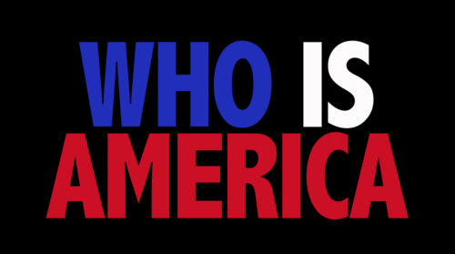
I couldn’t help but notice how jarring the titles for Showtime’s “Who Is America?” are, but I couldn’t put my finger on why. It’s clearly some condensed extra bold, which are often pretty ungainly, with some exceptions (Futura Bold Codensed, of Nike fame). My first thought was that it might be something like Calibri or Tahoma, some unsightly humanist sans that was even possibly manually stretched.
I Googled around for a screenshot of the titles, and what I found instead was a lot of promotional material that primarily does use Futura Bold Condensed:
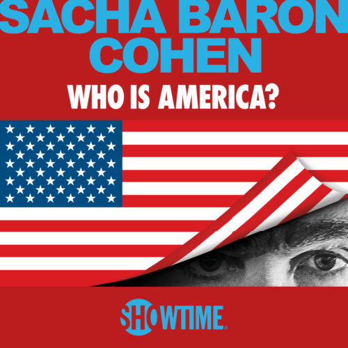
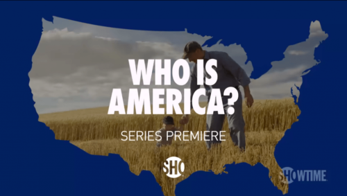
(And Arial Bold, unfortunately.)
I can’t help but wonder if the designers behind the titles in the aired show were trying to mimic Futura Bold Condensed, but either weren’t able to or didn’t know they weren’t using the same typeface.
I admit I had to look it up, but the typeface they are using is Abadi Condensed Extra Bold. Why this typeface? After a little more Googling I learned that Abadi is included in several Microsoft products.
What isn’t included in most Microsoft products? Futura Bold Condensed.