Firefox 3 is scheduled to be released later this fall; I haven’t really been following its development, but one thing I have heard about and am excited about is its (or, more accurately, Gecko‘s) new graphics library, Cairo.
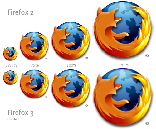
First I heard that it would resample rather than simply rescale images, as demonstrated in the image above (via Acts of Volition).
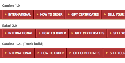
Later I learned that it will also render fonts more smoothly. I enjoy the soft way pages look in Safari for Windows, the result of a different rendering engine, WebKit, so this is something I’m really looking forward to. Here’s an example of Cairo’s font rendering, as seen in Camino 1.2+ for Mac, via hicksdesign:
There are very specific reasons for the intentional differences in these approaches to font rendering. It’s a matter of personal preference, and I think my preference will be for Cairo. Some are floored by the superiority of WebKit, and designer Jeffrey Zeldman makes a solid, objective case for it; others are horrified.
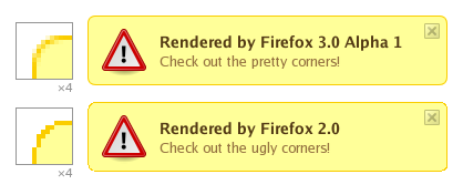
Finally, Gecko’s non-standard CSS attribute -moz-border-radius, a precursor to CSS3‘s border-radius attribute, will make image-less rounded div corners easy and pretty (via Acts of Volition):
I would have posted screenshots of my own, but I don’t trust these alpha builds not to eff things up.
Mark Rowe says:
If you take the time to read the comments on the hicksdesign post you link to, you’ll notice that Camino’s rendering was due to a bug. To quote David Smith:
If you compare the rendering of Camino 1.5, which as the version number suggests is newer than Camino 1.2+, on Amazon UK to that of the screenshot you posted, you’ll notice that it now renders virtually identically to the Camino 1.0 and Safari 2.0 screenshots. The reason for this? It’s the correct rendering! I agree that the buggy rendering does look nicer, but it’s a result of the inability to synthesize a bold variant of a font when the font has no native bold itself. You could get an identical rendering in Camino 1.0 and Safari 2.0 if you disabled the bold styling on that navigational element.
Spreading misinformation really isn’t cool.
Sumner says:
^
I
I
lol what a tool
Sumner says:
by the way that arrow is pointing to everyone above it.