This post was written regarding Ubuntu 8.10, Intrepid Ibex.
This isn’t the first time I’ve encountered hinting; I’ve seen it before in GIMP, even when I was using it in Windows, this font rendering option that was inexplicably on by default, and resulted in horrible kerning and misshapen letterforms. I don’t claim to know a lot about the technicalities of hinting, but everything I do understand about it agrees that it is meant to improve the shapes of letters. If this is the case, somebody is doing something very, very wrong. I haven’t seen a hinted font that looked anything other than sickly and disheveled.
I’ve complained before about the typography in Ubuntu, but my contention then was with the fonts that were in use by default, not with the way they were rendered. What I didn’t realize at the time is that the rendering is the bulk of the problem.
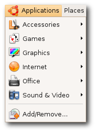 I found this image on the Ubuntu site, and I am still in disbelief that they choose to represent themselves with font rendering like this. Look at that capital ‘A’ and ‘V’; look at the way that lower-case ‘l’ towers over its neighbors, nothing more than a single-pixel-width vertical line; look at the kerning in the ‘Rem’ of ‘Remove’ – it’s no wonder Ubuntu has about a 2% worldwide market share. They expect people to want to look at that every day of their lives? I know these are relatively subtle details, but their effects are subliminal and, I believe, psychologically hazardous.
~/.fonts.conf
Of course, when it comes to Linux, for every problem there are a few dozen solutions – or one very, very complicated solution. GNOME, the default desktop for Ubuntu, arrives with a “Font Rendering Details” dialog box in its appearance settings, to placate the mouth-breathing philistines who need a GUI to get things done. And it doesn’t really help much. I knew I’d have to get my hands dirty in ~/.fonts.conf, this XML file that is capable (and only capable) of incredibly fine-tuned font tweaking.
[Fonts are] the #1 reason why Linux hasn’t seen any significant adoption on the desktop/laptop yet. Robert Scoble
The trouble, as is the case with most Google results you get when looking for help with Linux, is that there is a glut of quick fixes, blocks of code directed towards one specific person and their specific system, that they are then told to paste into a file or save into a directory, with little to no explanation about why this solution is going to work. Or there’s the technical documentation that isn’t geared towards users. There’s no middle ground (unless you count the occasional, skeletal wiki that hasn’t been updated since 2004).
Only after looking at countless ~/.fonts.conf examples was I able to glean what was going on inside them. The full power of this file allows you to target with amazing precision any variant or size of any font your system might display and give it its own unique properties; but there are really only three(ish) of these properties that you need to know about, and I am going to explain them here.
antialias
Anti-aliasing is the trick that makes your pixels not look like pixels. You’ve noticed this when you’ve seen poorly resized images with jagged edges – they’re not properly anti-aliased. Similarly, if fonts are not anti-aliased, they look like black Tetris pieces on a white background. Anti-aliasing is going on all the time without you knowing about it, and you’d really have to make an effort not to have it, but it’s worth putting in your ~/.fonts.conf file for good measure. You’ll want to apply it to all fonts on your system, so the syntax would be:
<match target="font">
 <edit name="antialias" mode="assign">
  <bool>true</bool>
 </edit>
</match>
You can probably figure out what these things mean, but I will link to a complete manual for ~/.fonts.conf syntax at the end of this post.
rgba
This one is a matter of personal preference, I guess. I don’t see how anybody of sound mind could stand to have pink, beige, and turquoise pixels sprinkled around the edges of their letters – the result of “sub-pixel rendering” – but I guess the argument is that it allows them to be sharper. Whatever.
Trust me when I say that things look best if you tell ~/.fonts.conf to disable sub-pixel rendering, which is done like so:
<match target="font">
 <edit name="rgba" mode="assign">
  <const>none</const>
 </edit>
</match>
If you happen to be schizophrenic, or colorblind or whatever, then yes, fine, you can turn on sub-pixel rendering by changing none to rgb, to reflect the composition of your monitor’s subpixels (which are almost certainly in the order Red-Green-Blue, from left to right). Have fun scratching your eyeballs out.
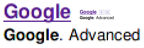
rgba=rgb
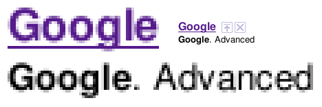
rgba=none
Admittedly it would be nice if there were some antialiasstyle property you could set to antialiasslight or something, to lighten up those gray pixels a little bit.
hinting / autohint / hintstyle
Put it on my tombstone: Turn Off Hinting. I’m begging you. If somebody tries to tell you that this is a matter of preference, they are lying to you, and are not your friend, and are probably banging your girlfriend. If you leave hinting on, Georgia will not look like Georgia, Lucida will not look like Lucida, and Nimbus will not look like Helvetica.

hintstyle=hintnone
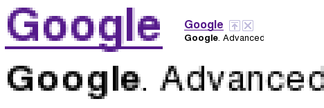
hinting=true, autohint=true
Here is how you Turn Off Hinting®:
<match target="font">
 <edit name="hinting" mode="assign">
  <bool>false</bool>
 </edit>
 <edit name="autohint" mode="assign">
  <bool>false</bool>
 </edit>
 <edit name="hintstyle" mode="assign">
  <const>hintnone</const>
 </edit>
</match>
Alternatively, if you positively demand more “crispness” from your fonts, even at the expense of aesthetics, you might want to give slight hinting a try. From the above code, change hinting and autohint to true, and hintstyle to hintslight:
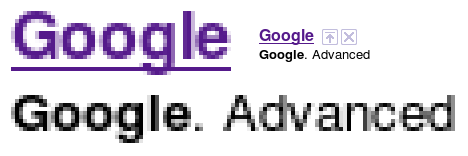
hintstyle=hintslight
That’s it, roughly speaking. It’s my understanding that some specific fonts do look better if specifically targeted and adjusted with maybe slight hinting. But that’s for another day. If you do as I’ve instructed, things will be so much better for you. Leave a comment if you want my PayPal address.
This post would not have been possible without the help of these sites:
- ArchWiki: I know nothing about Arch Linux, but this wiki page has a lot of good info.
- fontconfig.org: the most complete and recent ~/.fonts.conf reference I’ve found.
- Ubuntu Wiki: contains an example of a very comprehensive (if dated) ~/.fonts.conf file. Study it and learn how to do other stuff.
- The Masterplan: another sample ~/.fonts.conf file, and the only other one that I know of that turns off hinting and subpixel rendering.
 I found this image on the


 As far as I can tell, there are no additional “themes” out there. But I did find the